
Showing posts from category Eye On.
-
Saleem Ali at TEDxUVM on Environmental Peacemaking
›“The use of the term ‘peace’ is in many circles still considered taboo, because immediately people think you are talking about something that is utopian,” said University of Vermont Professor Saleem Ali at a recent TEDx event on sustainability. “But I’m here to tell you that peace is pragmatic. Peace is possible.”
Ali points out the value of peace to every sector of society and, using an example from Ecuador and Peru, argues for the utility of the environment as a peacemaker. Other longstanding conflict areas like Cyprus, Iraq, Israel, and Korea are also ripe for environmental peacebuilding efforts, he says.
Professor Ali has written for The New Security Beat before on the strengths and weaknesses of viewing conservation and sustainability efforts through a strictly security lens. He points out that environmentalists must tread a fine line when assigning causality between the environment and conflict, but even when natural resources or climate are not central to a conflict, environmental peacebuilding can still play a role in creating shared ground (sometimes literally) between combatants.
“Treasures of the Earth,” Ali’s latest book, examines the thorny subject of how best to balance resource extraction in developing countries with long-term sustainability. Recent examples, such as Angola and Liberia’s blood diamonds, the DRC’s conflict minerals, and concerns over Afghanistan’s potential reserves have shown the difficulty in striking that balance.
“Ultimately, conflict trumps everything else” in terms of what we ought to be concerned with, Ali argues, and therefore, anyone, no matter their profession or capacity, should keep the pursuit of peace in mind – and all options on the table – when making decisions that affect others. -
Floods, Fire, Landslides, and Drought: The Guardian’s “Weather Crisis 2010”
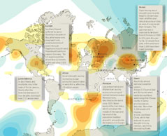
› From the Guardian’s DataBlog comes an excellent overview of some of the extreme weather affecting the globe this summer, from the devastating floods in Pakistan which have inflicted “huge losses” to crops and exacerbated an already tenuous security situation, to the wildfires in Russia which have smothered the capital in dangerous smog and crippled domestic wheat supplies.
“Global temperatures in the first half of the year were the hottest since records began more than a century ago,” writes author and graphic artist Mark McCormick.
The orange areas of the map represent high pressure systems and the blue, low pressure systems, which as explained by Peter Stott of the Met Office, are important indicators of the rare climatic conditions that caused this summer’s abnormal conditions across Eurasia.
The flooding in Pakistan has garnered the most international attention, having now affected more people than the 2004 tsunami, 2010 Haiti earthquake, and 2005 Kashmir earthquake combined. Other highlighted areas of the map include flooding in Poland and Germany, drought in England, mudslides in Latin and South America, record-breaking drought and hunger in West Africa, and flooding and landslides in China, which recently pushed the world’s largest hydroelectric dam to its limit and have now been blamed for more than 1,000 deaths.
Although it does a good job highlighting the frequency and severity of extreme weather events this summer, it’s important to note that the map only covers events in July and August. That leaves out the “1000-year” floods in Tennessee this May as well as the heavy snowfall seen in the Northeast United States and the winter of “white death” in Mongolia earlier this year, which also severely disrupted local and national infrastructure as well as a great many people’s livelihoods.
Sources: Agence France-Presse, BBC, Guardian, National Oceanic and Atmospheric Administration, New York Times, Telegraph, UN Dispatch.
Image Credit: “Weather Crisis 2010” by Mark McCormick, courtesy of Scribd user smfrogers and The Guardian. -
Boosting the U.S. Role in the Global Health Arena
›A new video from the Commission on Smart Global Health Policy, which was established by the Center for Strategic & International Studies, reviews the commission’s progress towards its goal of encouraging the U.S. government to embrace global health as a pillar of U.S. foreign policy.
The video reviews the recommendations from the commission’s March 2010 report, A Healthier, Safer and More Prosperous World: 1) Maintain robust U.S. support for the fight against HIV/AIDS, malaria, and tuberculosis; 2) Prioritize maternal and child health, especially in sub-Saharan Africa and South Asia; 3) Help other nations improve their capacity to prevent and respond to outbreaks of contagious disease; 4) Expand U.S. capacity to fund future global health initiatives by securing long-term investments for such efforts; and 5) Step up U.S. funding for multilaterals engaged in the global health field, including the World Health Organization, Global Fund, UNICEF, the World Bank, and the GAVI Alliance.
In the months ahead, commission members will be participating in public forums throughout the United States to discuss and promote the recommendations included in the report, before gathering in January to review the Obama administration’s progress on global health as the administration begins its third year. To date, the centerpiece of the administration’s health outreach efforts has been the six-year, $63 billion Global Health Initiative, designed to promote an enhanced U.S. role in addressing public health issues overseas.
The CSIS Global Health Policy Center will also be launching a year-long debate series called “Fault Lines in Global Health,” focusing on controversial topics in the global health field. The series’ kick-off event will center on U.S. AIDS funding, and is scheduled for Friday, August 6, 2010, from 9:30-11:00 a.m. -
PRB Maps the PHE World
›The Population Reference Bureau (PRB) has created an interactive Google map that highlights population, health, and environmental programs in Africa, Asia, and Latin America. The Population, Health, and Environment (PHE) Map shows the locations of projects that combine improved health services, sustainable natural resource management, and ecosystem conservation.
According to PRB’s Maura Graff and Jason Bremner, “the map aims to give viewers both a sense of the scale of current PHE integration efforts, and specific information about individual organizations, projects, and their location.”
Clicking on a marker will reveal the title of a PHE program, a short description of its goals and outcomes, a link to its website, and the occasional picture of the project in action. A list on the left alphabetically catalogs all the projects based on region.
The map also provides the opportunity for those working on PHE projects in the field to find nearby projects in order to share experiences. For example, in Ethiopia, Population Media Center and DSW’s Youth to Youth could share lessons learned about disseminating information on the reduction of female genital mutilation, the importance of providing family planning services to young married couples, and the linkage between reduced family size and enhanced stewardship of social and natural resources.
Communities that understand how population, health, and environment are intertwined are more engaged and energized to make a difference. In a video interview with ECSP, Roger-Mark De Souza, director of foundation and corporate relations at the Sierra Club, explains that PHE projects are so effective because solutions to a community’s liked problems demand this logical integration. For example, while learning about the health benefits of birth spacing, father and mothers also learn how their family planning decisions can improve the economic and environmental prospects of the community.
Just like PHE projects themselves, the map is a work in progress; PRB is seeking to add PHE projects that are still active or ended after 2005. Please contact Maura Graff if you would like to add a project.
Josephine Kim is a cadet at the United States Military Academy at West Point, and an intern with the Woodrow Wilson Center’s Environmental Change and Security Program. -
WomanStats Maps Gender-Linked Security Issues
›The WomanStats Project has published an array of maps depicting the challenges and conditions facing women worldwide today. The maps, which serve as a visual representation of the project’s database, cover gender-linked security issues such as: son preference and sex ratio, physical security, inequity in family law, human trafficking, polygamy, maternal mortality, discrepancy in education, government participation, intermingling between the sexes in public, and required dress codes. These maps help researchers visually see correlations between two or more map themes. For example, Women’s Physical Security is moderately correlated to fertility rate, while Sex Ratio/Son Preference is not highly correlated to any other measures tested, such as women in the labor force, democracy, political rights, and economic rights. In addition to maps, the WomanStats Project’s database was used to create graphs that compare the scale values of Physical Security Clusters and Son Preference/Sex Ratio Distributions to the number of countries the scale level affected.
Some of the maps would benefit from additional functionality. For example, the “Women’s Physical Security” map broadly categorizes states based on high, medium, and low levels of security, but the legend is not linked to the definitions of these classifications. Another useful addition would be data tables that rank the countries for each theme. Such enhancements would better enable the viewer to perform empirical and spatial analysis of the status of women.
Overall, the WomanStats Project maps offer the viewer engaging visual depictions of how women’s lives vary across the world, and how countries compare to each other in terms of women’s security.
Josephine Kim is a cadet at the United States Military Academy at West Point and an intern with the Woodrow Wilson Center’s Environmental Change and Security Program.
Map and graph used courtesy of the WomanStats Project. -
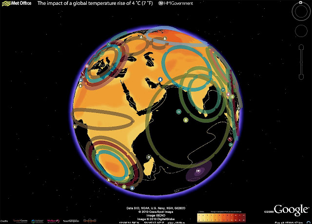
Rear Admiral Morisetti Launches the UK’s “4 Degree Map” on Google Earth
›Having had such success with the original “4 Degree Map” that the United Kingdom launched last October, my colleagues in the UK Foreign and Commonwealth Office have been working on a Google Earth version, which users can now download from the Foreign Office website.
This interactive map shows some of the possible impacts of a global temperature rise of 4 degrees Celsius (7° F). It underlines why the UK government and other countries believe we must keep global warming to below 2 degrees Celsius, compared to pre-industrial times; beyond that, the impacts will be increasingly disruptive to our global prosperity and security.
In my role as the UK’s Climate and Energy Security Envoy I have spoken to many colleagues in the international defense and security community about the threat climate change poses to our security. We need to understand how the impacts, as described in this map, will interact with other drivers of instability and global trends. Once we have this understanding we can then plan what needs to be done to mitigate the risks.
The map includes videos from the contributing scientists, who are led by the Met Office Hadley Centre. For example, if you click on the impact icon showing an increase in extreme weather events in the Gulf of Mexico region, up pops a video clip of the contributing scientist Dr Joanne Camp, talking about her research. It also includes examples of what the UK Foreign and Commonwealth Office and British Council are doing to increase people’s awareness of the risks climate change poses to our national security and prosperity, thus illustrating the FCO’s ongoing work on climate change and the low-carbon transition.
Rear Admiral Neil Morisetti is the United Kingdom’s Climate and Energy Security Envoy. -
New Film Looks at Sub-Saharan Africa’s Unmet Need for Family Planning
›A new documentary film released recently by Population Action International brings attention to the plight of women across sub-Saharan Africa who lack access to basic reproductive health supplies, such as condoms and contraceptives. Funded with the support of the Reproductive Health Supplies Coalition, “Empty Handed” documents the unmet need for family planning services in the region, which has some of the world’s highest fertility rates.
PAI filmmaker Nathan Golon shot the film in Uganda earlier this year. The film’s focus on Ugandan women’s struggles in particular is with good reason, as the country has a well-documented history of providing insufficient family planning services. According to the CIA’s World Factbook, Uganda has the world’s second highest total fertility rate at 6.73 children per woman.
“Empty Handed” examines how a lack of family planning tools and services can lead to a slippery slope of unintended consequences, from unplanned pregnancies to the rampant spread of sexually transmitted diseases. The film revolves around interviews conducted with women who share common hardships as they try to access family planning from under-resourced local healthcare clinics, often traveling long distances only to find upon arrival that no contraceptives or condoms are available.
In addition to identifying past and current issues with reproductive healthcare access in sub-Saharan Africa, “Empty Handed” also puts forward some ideas for better meeting family planning needs of the more than 200 million women throughout the world without access to even basic contraception.
To watch the full film online, visit the “Empty Handed” website.
Sources: C.I.A., FHI, Population Action International, Reproductive Health Supplies Coalition -
U.S. Navy Task Force on Implications of Climate Change
›What about climate change will impact us? That’s the question the Navy’s Task Force Climate Change is trying to answer. Rear Admiral David Titley explains the task force’s objectives in this interview by the American Geophysical Union (AGU) at their recent “Climate Change and National Security” event on the Hill.
The task force is part of the military’s recent efforts to try to better understand what climate change will mean for the armed forces, from rising sea levels and ocean acidification to changing precipitation patterns. In the interview, Admiral Titley points out that for the Navy in particular, it is important to understand and anticipate what changes may occur since so many affect the maritime environment.
The Navy’s biggest near-term concern is the Arctic, where Admiral Titley says they expect to face significant periods of almost completely open ocean during the next two to three decades. “That has huge implications,” says Titley, “since as we all know the Arctic is in fact an ocean and we are the United States Navy. So that will be an ocean that we will be called upon to be present in that right now we’re not.”
Longer term, the admiral points to resource scarcity and access issues and sea level rise (potentially 1-2 meters) as the most important contributing factors to instability, particularly in places like Asia, where even small changes can have huge impacts on the stability of certain countries. The sum of these parts plus population growth, an intersection we examine here at The New Security Beat, is something that deserves more attention, according to Titley. “The combination of climate, water, demographics, natural resources – the interplay of all those – I think needs to be looked at,” he says.
Check out the AGU site for more information, including an interview with Jeffrey Mazo – whose book Climate Conflict we recently reviewed – discussing climate change winners and losers and the developing world (hint: the developing world are the losers).
Sources: American Geophysical Union, New York Times.
Video Credit: “What does Climate Change mean for the US Navy?” courtesy of YouTube user AGUvideos.


