Showing posts from category Eye On.
-
Development or Security: Which Comes First?
› “Let’s take an area of conflict of great concern to us: Afghanistan. One of the very concrete questions is, do you invest your development efforts predominantly in the relatively secure parts of Afghanistan, which gives you more security gains in terms of holding them, or in the relatively insecure parts, where you’re most concerned with winning against the Taliban and the battle seems most in the balance?” With that question, Richard Danzig, the chairman of the board for the Center for a New American Security (CNAS), got to the heart of the issues being debated at a recent panel on development assistance and national security.
The discussion, hosted on September 5 by the Aspen Institute in conjunction with the Brookings Blum Roundtable on Global Poverty, brought together Rajiv Shah, the administrator of the U.S. Agency for International Development; Susan Schwab, professor at the University of Maryland and former U.S. trade representative; Sylvia Mathews Burwell, president of the Bill and Melinda Gates Foundation’s Global Development Program; and CNAS’ Danzig. Most of the hour-long discussion was spent debating whether assistance could be successful in insecure situations (like Afghanistan), or if a place has to have some kind of stability before assistance can really take root and successfully spur development.
Short vs. Long term
Administrator Shah, not surprisingly, made the argument that development assistance is valuable in either instance. That said, he also strongly cautioned against overpromising what aid in a place like Afghanistan can accomplish, saying that “one big mistake we’ve made is to oversell what any civilian agency can do in an environment where there’s an active military campaign.” He pointed out that “it not only raises the cost of doing the work…but it also puts people at real risk.”
Danzig took a more aggressive tone, saying that “in the great majority of cases I think it is misleading and distortive to argue for development on the grounds that it will predominantly enhance security.” He argued that more often than not, security should be a prerequisite for development: “You need to distinguish cart and horse here…in most instances…the security needs to precede the development.”
Shah and Danzig, who dominated the panel, were more in sync about what development assistance can accomplish in longer-term scenarios, when security and stability are assured. Shah in particular spoke forcefully about development assistance over time, stressing that “in the long view, in the medium term, the development priorities are national security priorities.”
Enabling Success
However, Shah did warn that aid could fall short of our goals if it not carried out in a reliable way. “Stability and predictability of finance is the single thing that’s most highly correlated with good outcomes,” he said. When our aid to a country comes and goes unreliably, flowing one year and stopping abruptly the next, it’s much harder to have the kind of positive impact we want it to have, he explained.
“Through the years, where these questions have been debated back and forth, there has been one constant,” said moderator Jessica Tuchman Mathews, president of the Carnegie Endowment for International Peace. “We have always multiplied the objectives vastly beyond the resources – always.”
Video Credit: Aspen Institute. -
IRP and TIME Collaborate on Indonesia’s Palm Oil Dilemma
›“Everything the company does goes against my conscience. But the question remains, who should work from the inside to inform everyone? Who should be pushing that these things are right, these things are acceptable, and these things are not?” says Victor Terran, in this video by Jacob Templin for TIME and the International Reporting Project (IRP). Templin traveled to Indonesia as part of IRP’s Gatekeeper Editor program in May 2011.
Terran is a resident of a village west of Borneo in the Kalimatan province, where he works as a field supervisor for one of the largest palm oil companies in Indonesia. Although the industry has supplied his village with much-needed employment and economic development, he worries that the influx of jobs has come at the expense of the health of the forests, agriculture, and clean rivers that sustain his village. “It’s not just about the money,” he says. “Will they sincerely keep the regulations and be fair to our community?”
An Industry with a Checkered Past
Terran’s skepticism of the industry is justified – palm companies, such as Sinar Mas, have a nasty track record of “abusing local labor and pilfering forests” for what they call “liquid gold,” says Templin.
Greenpeace released a report, “How Sinar Mas is Pulping the Planet,” in 2010 that alleged that Sinar Mas cut down important wildlife preserves, illegally planted on peat lands, and that these actions resulted in the release of considerable amounts of carbon into the atmosphere and loss of critical wildlife habitat.
As a result, the company lost major contracts with Unilever, Kraft, and Nestle. Sinar Mas CEO Franky Widjaya tells Templin that the company is taking definitive steps to prevent such instances from happening again, but that change will not happen overnight.
Akhir bin Man, a manager for another palm oil company, PT Kal, says he does not want to experience a public relations nightmare similar to Sinar Mas, so his company is seeking certification from the internationally recognized Roundtable on Sustainable Palm Oil (RSPO). The RSPO certification requires PT Kal to conserve nearly half of its land, use safer pesticides, and negotiate profit-sharing agreements with villagers.
Global Benefits
“These are not only vast forest landscapes which are home to species such as orangutans, elephants, and rhinos, but they’re also some of the globally most important reservoirs of carbon,” Adam Tomasek, director of the WWF Heart of Borneo Initiative, tells Templin.
Due to the wide-scale implications of disrupting such a substantial carbon sink, Tomasek and his colleagues see the destruction of these habitats as not just a local problem: “Sustainably managing the forest and carbon stocks that they contain here in Indonesia is not only important locally, not only important regionally, but an extremely important critical in the global approach to dealing with climate change,” he says.
Resisting the Juggernaut
Recognizing the inherent value of their natural resources, some villages are fighting to keep palm companies off of their land. Pak Bastarian is the head of such a village: “In my opinion, [palm] plantations are only owned by certain groups of people, and they don’t necessarily bring prosperity,” he tells Templin.
Bastarian is a reformed environmentalist whose hesitance toward the palm industry is a by-product of his own experiences – in the 1990s he worked for years running a timber company that illegally cut down trees. “I don’t know how many trees I cut down…a countless number.” Now, he uses his elected power to preserve trees like the ones he once cut down.
However, keeping the companies out of his village is an uphill battle, Templin explains. Bastarian says he faces mounting pressure from governmental officials, who make threats, and many villagers, who would rather have the jobs. He tells Templin that he even received bribes from PT Kal (an accusation they deny).
Bastarian’s position may cost him though – with elections right around the corner, he said does not know how much longer he can keep the palm companies out.
“My worry is that if our forests are cleared, our children will not be able to see what protected wood looks like, or what protected animals look like,” he tells Templin. When the palm oil companies first came, he chose to wait and see how the other villages fared before allowing them to come in. “To this day,” he says, “I’ve never changed my mind.”
Video Credit: “Indonesia’s Palm Oil Dilemma: To Cash In or Fight for the Forests?,” courtesy of the International Reporting Project. -
Watch: Aaron Wolf on the Himalayan and Other Transboundary Water Basins, Climate Change, and Institutional Resilience
›When Aaron Wolf, professor in the Department of Geoscience at Oregon State University, and his colleagues first looked at the dynamics behind water conflict in their Basins at Risk study, they found that a lot of the issues they’d assumed would lead to conflict, like scarcity or economic growth, didn’t necessarily. Instead they found that “there is a relationship between change in a [water] basin and the institutional capacity to absorb that change,” said Wolf in this interview with ECSP. “The change can be hydrologic: you’ve got floods, droughts, agricultural production growing…or institutions also change: countries kind of disintegrate, or there are new nations along basins.”
However, these changes happen independently. “Whether there is going to be conflict or not depends in a large part to what kind of institutions there are to help mitigate for the impacts of that change,” explained Wolf.
“If you have a drought or economic boom within a basin and you have two friendly countries with a long history of treaties and working together, the likelihood of that spiraling into conflict is fairly low. On the other hand, the same droughts or same economic growth between two countries that don’t have treaties, or there is hostility or concern about the motives of the other, that then could lead to settings that are more conflictive.”
Wolf stressed the importance of understanding hydrologic variability in relation to existing treaties around the world. After carefully examining hundreds of treaties, he and his colleagues created a way of measuring their variability to try to find potential hotspots.
“We know how variable basins are around the world; we know how well treaties can deal with variability. You put them together and you have some areas of concern: You may want to look a little closely to see what is happening as people try to mitigate these impacts,” said Wolf.
“We know that one of the overwhelming impacts of climate change is that the world is going to get more variable: Highs are going to be higher, and lows are going to be lower,” Wolf said.
Wolf used the Himalayan basins to illustrate the importance of overseeing the potential effects of climate change and institutional capacity. “There are a billion and half people who rely on the waters that originate in the Himalayas,” he pointed out. Because of climate change, the Himalayas may experience tremendous flooding, and conversely, extreme drought.
Unfortunately, Wolf said, “the Himalayan basins…do not have any treaty coverage to deal with that variability.” Without treaties, it is difficult for countries to cooperate and setup a framework for mitigating the variability that might arise. -
UN Security Council Debates Climate Change
›Today the UN Security Council is debating climate change and its links to peace and international security. In this short video, ECSP Director Geoff Dabelko outlines his hopes for today’s session and its follow-on activities. He suggests it is time to move from problem identification to problem solving by developing practical steps to respond to climate-security links.
This Security Council debate was held at the instigation of the German government, chair of the Security Council this month. But it is not the first time this body has debated climate and security. In 2007, the United Kingdom used its prerogative as chair to introduce the topic in the security forum. Opinions from member states diverged on whether the Security Council was the appropriate venue for climate change.
Largely at the instigation of the Alliance of Small Island States, the UN General Assembly tackled climate and security links in 2009. The resulting resolution also spurred the UN Secretary-General to produce a summary report on the range of climate and security links.
Sources: Reuters, UN. -
Failed States Index 2011
›“The reasons for state weakness and failure are complex, but not unpredictable,” said J.J. Messner, one of the founders of the Fund for Peace’s Failed States Index, at the launch of the 2011 version of report in Washington last month. The Index is an analytical tool that could aid policymakers and governments seeking to prevent and mitigate state collapse by identifying patterns of underlying drivers of state instability.
The Index ranks 177 countries according to 12 primary social, economic, and political indicators based on analysis of “thousands of news and information sources and millions of documents” and distilled into a form that is meant to be “relevant as well as easily digestible and informative,” according to the creators. “By highlighting pertinent issues in weak and failing states,” they write, the Index “makes political risk assessment and early warning of conflict accessible to policymakers and the public at large.”
Common Threats: Demographic and Natural Resource Pressures
The Index reveals that half of the 10-most fragile states are acutely demographically challenged. The composite “Demographic Pressures” category takes into account population density, growth, and distribution; land and resource competition; water scarcity; food security; the impact of natural disasters; and public health prevention and control. Additional population indices are found in “Massive Movement of Refugees or Internally Displaced Persons (IDPs),” and health indicators, including infant mortality, water, and sanitation, are spread across several categories.
Not surprisingly, some of the most conflict-ridden countries show up at the top of the list. The Index highlights some of the lesser known issues that contribute to their misery: demographic and natural resource stresses in Afghanistan, Iraq, Nigeria, Pakistan, and Yemen (a list that would include Palestine, if inclusion in the Index were not contingent on UN membership); the DRC’s conflict minerals; and Somalia and Sudan’s myriad of environmental and migration problems, which play major roles in their continued instability.
Haiti, with its poor health and lack of infrastructure and disaster resilience, was deemed the Index’s “most-worsened” state of 2011. The January 2010 earthquake and its ensuing “chaos and humanitarian catastrophe” demonstrated that a single event can trigger the collapse of virtually every other sector of society, causing what Messner termed the “Humpty Dumpty effect” – while a state can deteriorate quickly, it is much harder to put it back together again.
The inclusion of natural resource governance within the social and economic indicators would render the Index a more complete analytical tool. In a 2009 report, the UN Environment Program (UNEP) found that “since 1990, at least eighteen violent conflicts have been fueled by the exploitation of natural resources,” and that effective natural resource management is a necessary component of conflict prevention and peacebuilding operations.
The Elephant in the Room: Predicting the Arab Spring
Why did the Index fail to predict the Arab Spring sweeping the Middle East and North Africa? Many critics assert that the inconsistent ranking of the states, ranging from Yemen (ranked 13th) to Bahrain (ranked 129th), demonstrates that the Index is a poor indicator of state instability. Particularly, critics argue that many of the countries experiencing revolutions were ranked artificially low.
“Of course, the Failed States Index did not predict the Arab Spring, and nor is it intended to predict such upheavals,” said Messner at the launch event. “But by digging down deeper into the specific indicator analysis, it was possible to observe the growing tensions in those countries.” The Index has consistently highlighted specific troubling indicators for the region, such as severe demographic pressures, migration, group grievance, human rights, state legitimacy, and political elitism.
Blake Hounshell, a correspondent with Foreign Policy (long-time collaborators with the Fund for Peace on the Index), wrote that the Index was never meant to be a “crystal ball” – even the best statistical data cannot truly encapsulate the complex realities that lead to inherently unpredictable events, such as revolutions. “It’s thousands of individual decisions, not rows of statistics, that add up to political upheaval,” Hounshell continued.
Demographer Richard Cincotta’s work on Tunisia’s revolution illuminates how the Index’s linear indicators can mask a complex reality. Whereas the Failed States Index simply measures “demographic pressure” as a linear function of how youthful a population is, Cincotta pointed out at a Wilson Center event that it was actually Tunisia’s relative demographic maturity that paved the way for its revolution and gives it a good chance of achieving a liberal democracy. Other countries in the region are much younger than Tunisia (Yemen being the youngest). The Arab Spring demonstrates that static indicators alone often do not have the capacity to predict complex social and political revolutions.
Sources: Foreign Policy, The Fund for Peace, UNEP.
Image Credit: Failed States Index 2011, Foreign Policy. -
Watch: Michael Renner on Creating Peacebuilding Opportunities From Disasters
›Michael Renner is a senior researcher at the Worldwatch Institute working on the intersection between environmental degradation, natural resource issues, and peace and conflict. Recently, Renner has focused on water use and its effects on the Himalayan region. In particular he’s working to find positive opportunities that can turn “what is a tremendous problem, into perhaps an opportunity for collaboration among different communities, among different regions, and perhaps…ultimately across the borders of the region,” he said during this interview with ECSP.
-
Watch: Richard Matthew at TEDxChange on Natural Resources, Conflict, and Environmental Peacemaking
›“It’s not surprising that about half the time, efforts to try to stabilize countries as they come out of war fail,” said Richard Matthew, associate professor at the University of California at Irvine and founding director of the Center for Unconventional Security Affairs, at a recent TEDxChange event. “Wars today are very destructive. They may not be as big as the wars of the last century, but they do a lot of damage.”
Matthew’s work focuses on the environmental dimensions of conflict and peacebuilding. Conflict can be spurred by competition over natural resources but it also contributes to further scarcity in many cases, creating a feedback loop. The natural resource aspect of conflict is particularly important in areas where livelihoods depend directly on access to land, water, and forests, he said.
In addition to discussing the benefits of including the environment in peacemaking efforts, Matthew also touched on the need for an increased proportion of national security spending to be spent on peace and development rather than defense. “It is in our interest to grow people out of the conditions that foster terrorism and extremism and infectious disease and crisis,” he said.
In particular, Matthew remains confident that an emerging group of leaders will find new and creative ways to support peacebuilding, natural resource management, and adaptation activities in the future: “Social entrepreneurs – people willing to combine their passion to make a better world with sound business tools – are developing truly innovative ways of taking daunting social problems and making them manageable.” -
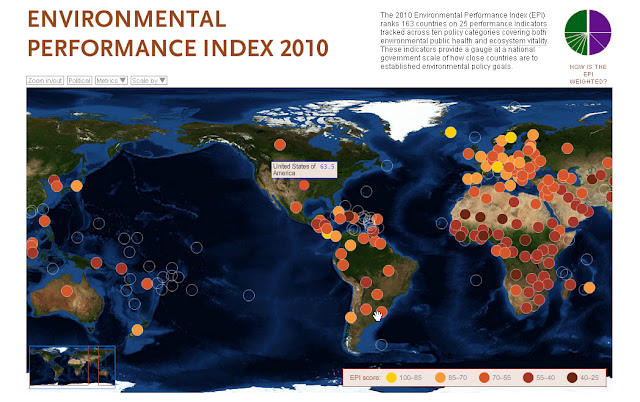
Measuring Ecosystem Vitality and Public Health With the Environmental Performance Index
›The Environmental Performance Index (EPI) is a comparative analytic tool for policymakers created jointly by Yale and Columbia Universities in collaboration with the World Economic Forum and Joint Research Centre of the European Commission. The EPI was created in 2006 and is updated biannually. Data is drawn from 25 performance indicators that fall under 10 well-established policy categories, including the environmental burden of disease, the effects of water on human health, and agriculture. The indicators serve as a “gauge at a national government scale of how close countries are to established environmental [and health] policy goals,” write the authors.
The EPI draws data from a diverse array of sources, such as the World Health Organization, Food and Agriculture Organization, University of New Hampshire, and World Resources Institute. Users can view visualizations of the compiled data via an interactive map and the data is also available in the form of rankings charts, individual country profiles, and country group comparisons. The interactive map also allows users to isolate performance indicators or policy categories in order to compare an individual country’s performance with global trends. Furthermore, indicators may be scaled to visually reflect a country’s performance in relation to drivers of environmental performance, like gross domestic product, level of corruption, and government effectiveness.
This tool is particularly useful because users can effectively leverage points for policy change by identifying linkages between environmental policy and other issue areas, such as public health or sanitation. The EPI enables policymakers to visually conceptualize problematic regions, optimize investments in environmental protection, and identify best practices.
The index’s greatest weakness is its inability to track changes in performance over time. A pilot project was launched last year that tracks whether a country has progressed or deteriorated in an area of environmental performance, but the authors note that the project has “raised more questions than answers,” particularly concerning data availability and interpretation. Additionally, there are gaps in the data. Although these gaps signify a data quality weakness, they also support the continued calls for increased data collection by governments and other organizations to better inform environmental decision-making.